
Bill W:
Chad G:
A donation screen sounds like a tiny feature. We treated it as a design test for the personality of the whole app.
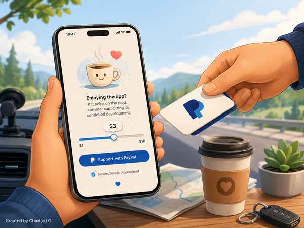
The app was supposed to remain useful whether anybody paid us or not, so the support feature could not become a nag. Instead of a giant DONATE button, the prompt asked for a small coffee-cup icon and a lighthearted message. The user could choose a tip with a deliberately ridiculous logarithmic slider, see the exact amount clearly, and hand the transaction off to PayPal.
Just as important were the things we refused to build. No card storage. No custom payment processor. No recurring billing. No countdowns, guilt messages or repeated popups. If somebody backed out of PayPal, the app simply carried on.
That little feature established a broader rule: useful software does not have to behave like a casino machine. We could make the app playful without making it manipulative.
@@@