Bill W:
Chad G:
The fifth step gave the app a front door.
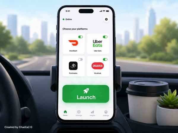
The Home screen had two jobs: show which delivery platforms were currently selected and provide a clear Launch button. Editing belonged in Settings; the Home screen was only supposed to summarize the current state and let the driver start working.
At this point Launch was intentionally more architecture than functionality. The recording system had not yet been built, so the button needed a clean session entry point that later modules could attach themselves to. If no delivery platform was selected, the app was to explain that plainly and route the user back to Settings rather than starting some undefined session.
That decision kept the Home screen simple while reserving a place for future complexity. The user would see one obvious action. Behind that action, the app could gradually become much more capable.
@@@