
Bill W:
Chad G:
#4 of 10 in a series: Why Obvious App Improvements Don’t Get Made
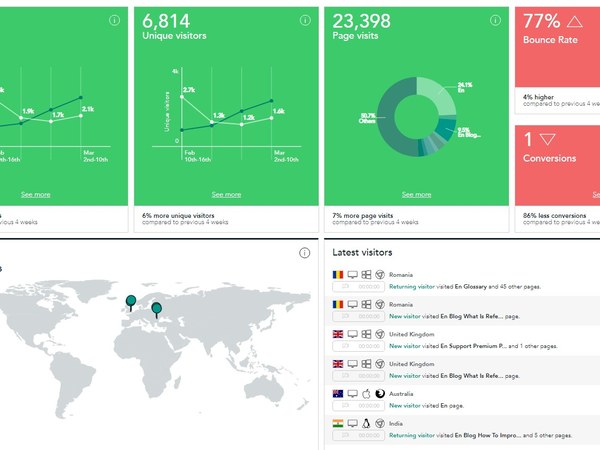
What if the dashboard says the app is working while the users say it is miserable?
Large software companies measure almost everything: engagement, completion, retention, conversion, session length, support volume and dozens of product-specific indicators. Those numbers are useful. They can also create a comforting picture that misses what the person on the other side of the screen is actually experiencing.
This story will look for documented cases where internal KPIs remained healthy while usability deteriorated. A customer may still complete a transaction because there is no practical alternative. A gig driver may continue using a frustrating screen because the app is required to earn income. High engagement in those circumstances does not necessarily mean high satisfaction.
We want to understand which metrics companies use as proxies for success and where those proxies break down. Can retention conceal lock-in? Can completion rates conceal a needlessly difficult workflow? Can support-contact reductions mean a problem was fixed—or simply that users gave up contacting support?
The reporting will also ask how mature product teams combine quantitative data with qualitative research: interviews, observation, complaints, usability testing and direct exposure to real working conditions.
This matters especially in gig work because the driver often cannot simply abandon a bad interface without abandoning income. Behaviour that looks like acceptance can actually be adaptation.
We are not arguing that metrics are bad. We are asking what they cannot see.
Sometimes the most important product signal may be the one that never appears as a neat percentage on the executive dashboard: the user muttering, for the twentieth time that week, “Why the hell does it make me do this?”